The brand signature
Consistently and compellingly telling the Mount Royal story goes beyond the words we use. It also requires using a consistent look and feel. Mount Royal's logo reflects our direction as a university as well as our proud history. It is rich in symbolism and tradition and has been internationally recognized.
It is important for us to consistently and correctly present our logo in all of our marketing and communications. Each piece we create - whether written or visual, printed or electronic - makes a statement about who we are. For this reason, basic rules for proper use and consistent design have been developed to maintain the integrity of our logo.
Please review Mount Royal University's guidelines which provide information to maintain consistency including proper logo use, corporate fonts and colours:
- Mount Royal Style Guide - style guidelines for print and web are available on MyMRU on the Employee page in Work Tools
- Mount Royal University Brand Guidelines (PDF) - In addition to complete logo graphic guidelines for proper usage, this document outlines how to represent the Mount Royal brand consistently in a variety of mediums
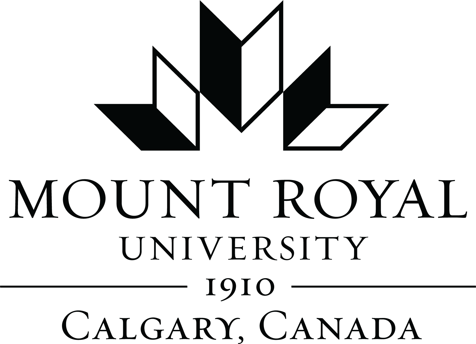
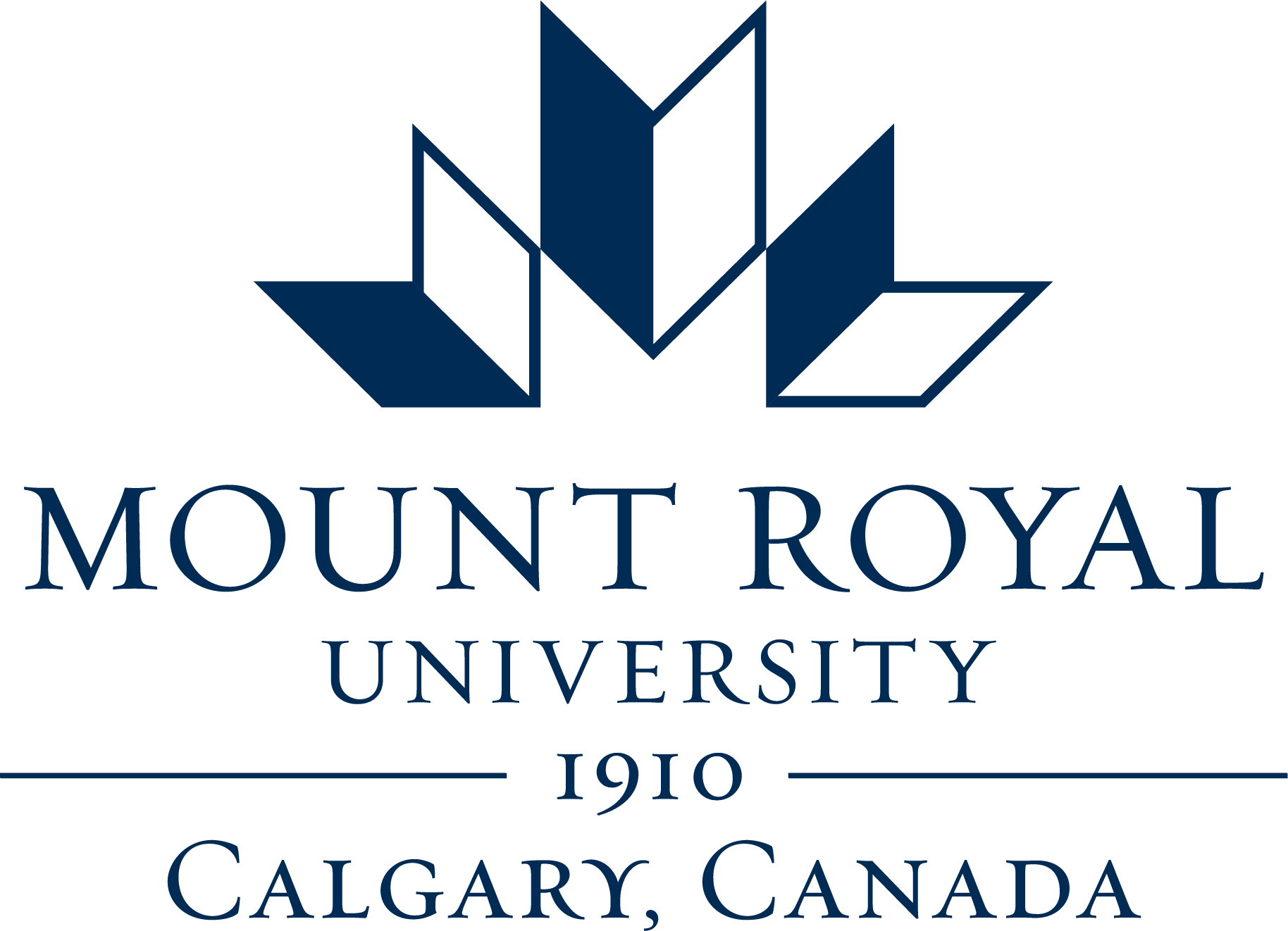
What our logo represents
Mount Royal's logo reflects our new direction as a university as well as our proud history. It is rich in symbolism and tradition:
- Like Mount Royal's previous logo, the three folding forms represent open books - classic symbols of education and learning. They suggest our past, present and future, and they reflect open doors, suggesting access to higher education - a core principle at Mount Royal - and our vision of creating exceptional learning experiences for a world of possibilities.
- These shapes were also inspired by the architecture of Mount Royal's campus - both the East Gate and the West Gate entrances - as well as the design of the George Kerby Memorial Carillon, named after our first principal.
- The letter "M" for Mount Royal is created where the three folded forms meet.
- The graphic also suggests the subtle shape of a maple leaf, reflecting Mount Royal's aspiration to become Canada's premier undergraduate university based on student success and satisfaction.
- The blue of the logo continues Mount Royal's traditional blue, but in a deeper shade that aligns with our Face to Face brand.
- Mount Royal's founding date - 1910 - acts as the foundation for the logo and proudly reflects nearly 100 years of academic excellence and leadership.
Logo downloads
We have supplied various file formats of the logo to support your needs:
- EPS - This is a vector file format that is typically used with graphic design programs such as Adobe InDesign and Illustrator.
- JPG - A standard image format that is compatible with Microsoft Word and PowerPoint.
- PNG - Typically a web format but can also be used in Microsoft Word and PowerPoint and also supports transparencies.
To save the logo files right click on the links below and select "Save Link As."
You can also download a full MRU logo package (ZIP file)
Primary logo
Calgary, Alberta logo


Calgary, Canada logo

PowerPoint template
MRU logo for email signature
Questions about our logo?Email marketingandcommunications@mtroyal.ca.
For a faster response, please type one of the following subjects into the subject line of your email:
- For design inquiries, subject line should read Design
- For inquiries about stationery template use, subject line should read Template
- For general use inquiries, subject line should read General